
What is it?
A reimagined IT Help Center experience for students and faculty who need technology help. This website includes information about university services, support and avenues to get more efficient self-help.
What was our goal?
The purpose of our engagement was to provide the university with their requirements and provide a strategic direction that would improve the community’s experience with getting IT help online. We determined through research and data that a self-serve solution would reduce the need for submitting tickets, calling and emailing for help.
Understanding the Barriers of Self-Help
Students, staff and faculty were calling or emailing the IT Help Desk far more than the agents were able to keep up. The community often felt that their situations were urgent whenever they had questions about IT services, so a delay in response caused frustration. The university wanted to understand the current barriers and requirements needed to shift the culture from calling to being self-led with a digital, online user experience.
What’s the challenge?
To better understand the problem we are facing and the current state of their IT Support platform, we performed a heuristic evaluation of their current IT support platform, analyzed their data and discovered the issues that caused the highest ticket volumes.
Assembling the Pieces
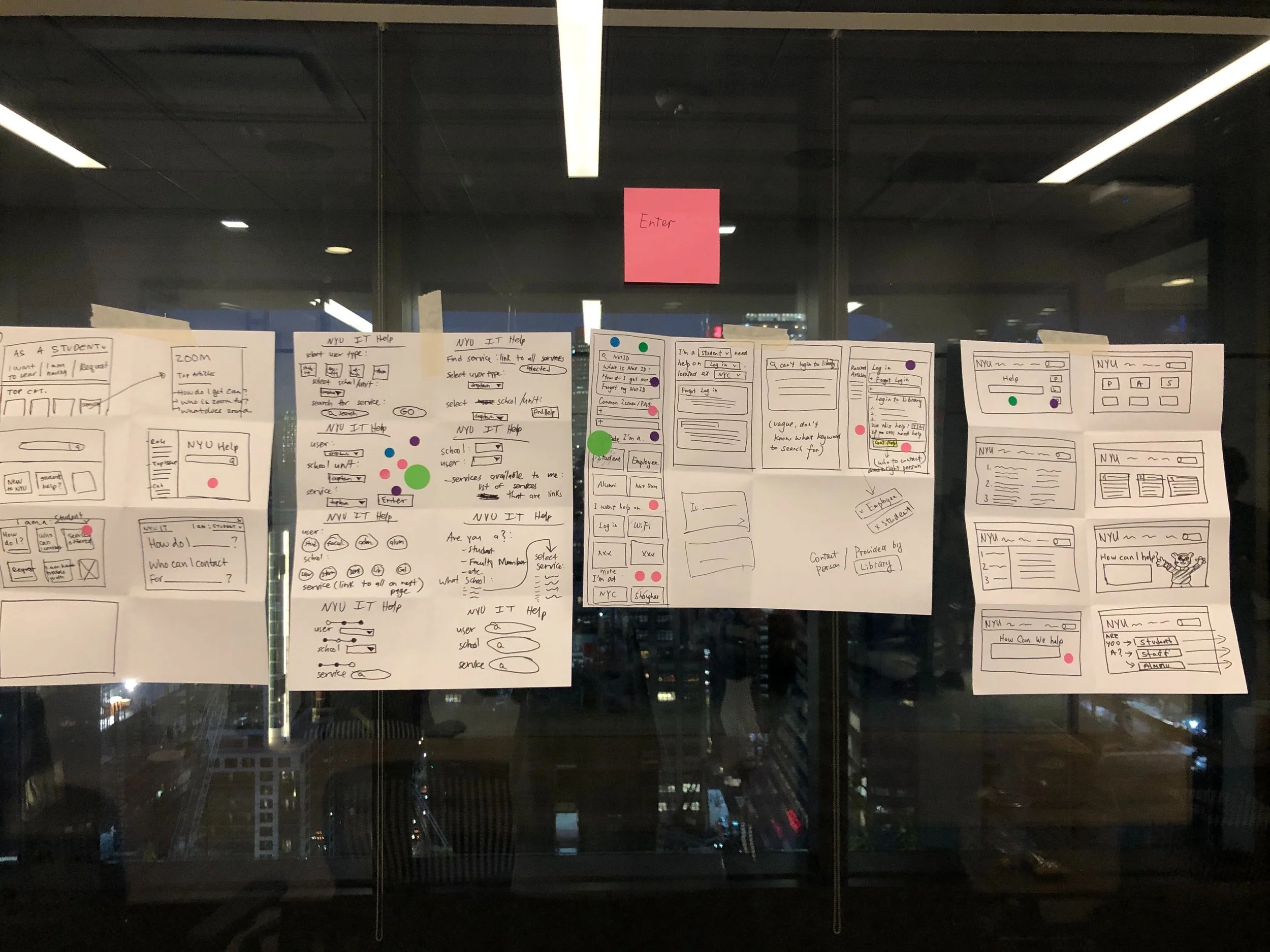
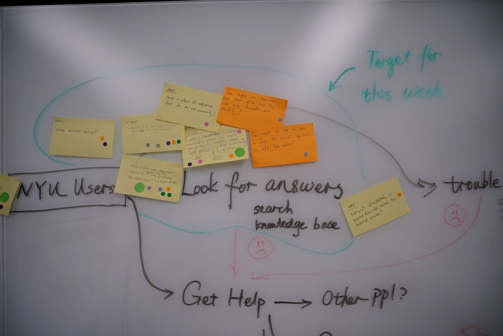
Having gathered our research and analytics we conducted a 2 week workshop with university stakeholders. During the workshop, we aligned on research findings, captured more insights from the university’s stakeholders, and aligning on the opportunities and goals for our engagement:
How might we reduce the number of tickets being submitted and the need to call or email the IT Help Desk by creating awareness and leading users to find answers easily?
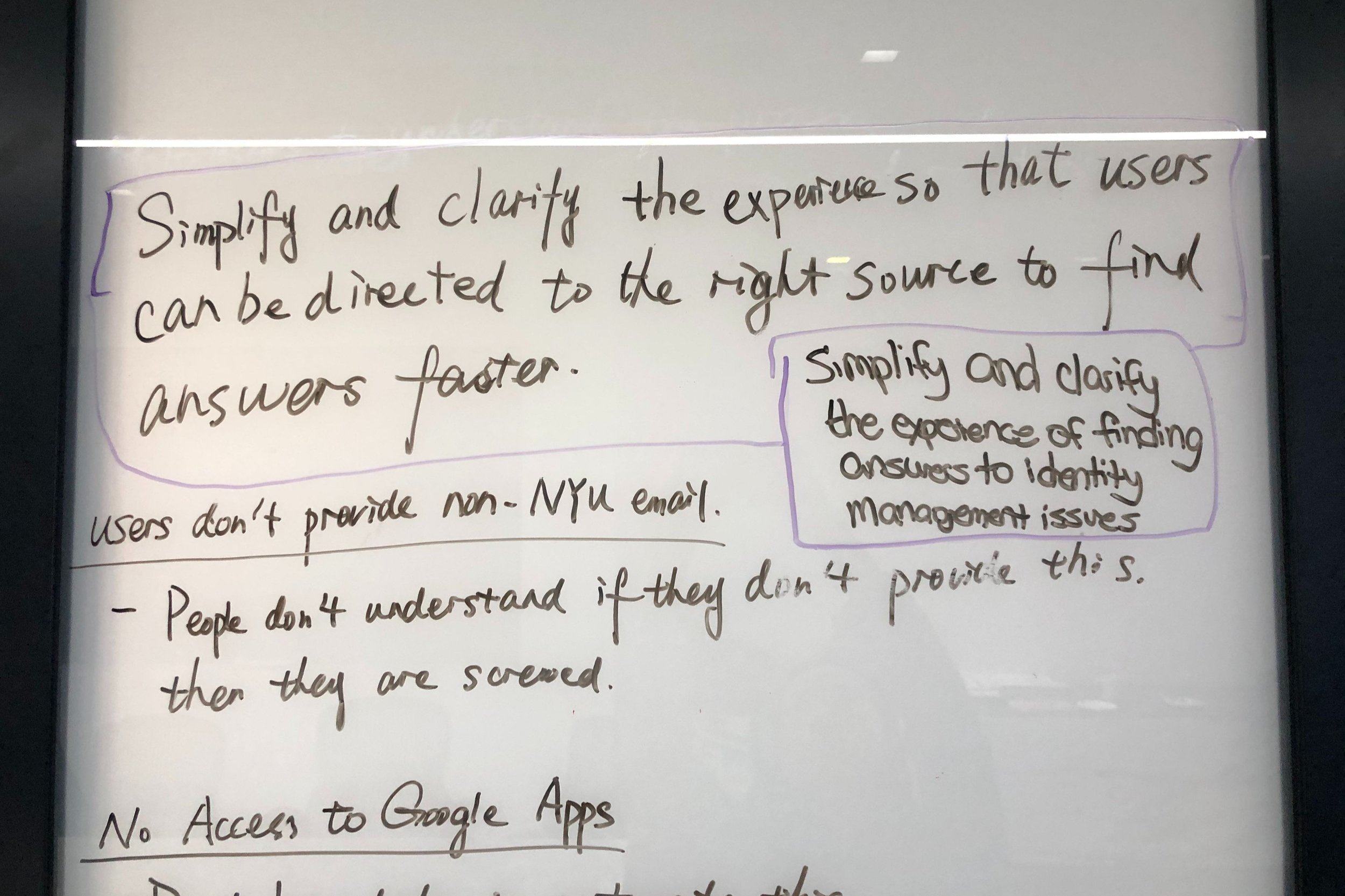
How might we simplify and clarify the experience so that users can be directed to the right source to find answers faster so that users will self-serve?
We were able to validate our proposed solutions after ideation, prototyping and testing before moving on to high-fidelity design.
Direction Driven by Research and Analysis
To better understand the problem we are facing and the current state of their IT Support platform, we performed a heuristic evaluation of their current IT support platform, analyzed their data and discovered the issues that caused the highest ticket volumes. In addition, we also interviewed real users. Through deep research, we learned that:
Out of almost 98,000 tickets from last year, 91.2% of them were logged by phone and email. We gained insights that the community were calling or emailing in their issues because they weren’t able to find the answers on their own through the current IT Help platform.

Working with stakeholders to identify key insights, then translating them into solutions and engaging them with activities like storyboarding during design workshops.
University Community (Faculty, Staff, Students):
Struggled to find answers on their own with the current IT Support platform due to little to no information hierarchy in the content of both a category and/or article
Long wait times for their submitted tickets to be processed
When wireless connections were down due to an outage, the community were not notified; which led many users to attempt to troubleshoot issues that could not be resolved at their end.
Users had problems categorizing their issues with the current naming conventions (13.4% of tickets were not categorized by users who submitted them).
Had problems describing their issues and resulted in IT agents not fully understanding the problem.
IT Help Desk Agent
Received more tickets, emails, calls than they could handle daily.
Required multiple emails between users to fully understand the issue.
Empowering through Personalization
Homepage and Category pages surface content and important calls to action.
It helps with:
the searchability of content as it surfaces information in a more visual hierarchy
easing the issues of information architecture by organizing content in a way that users would understand.

Homepage for IT support.

Eases the issues of information architecture by organizing content in a way that users would understand.
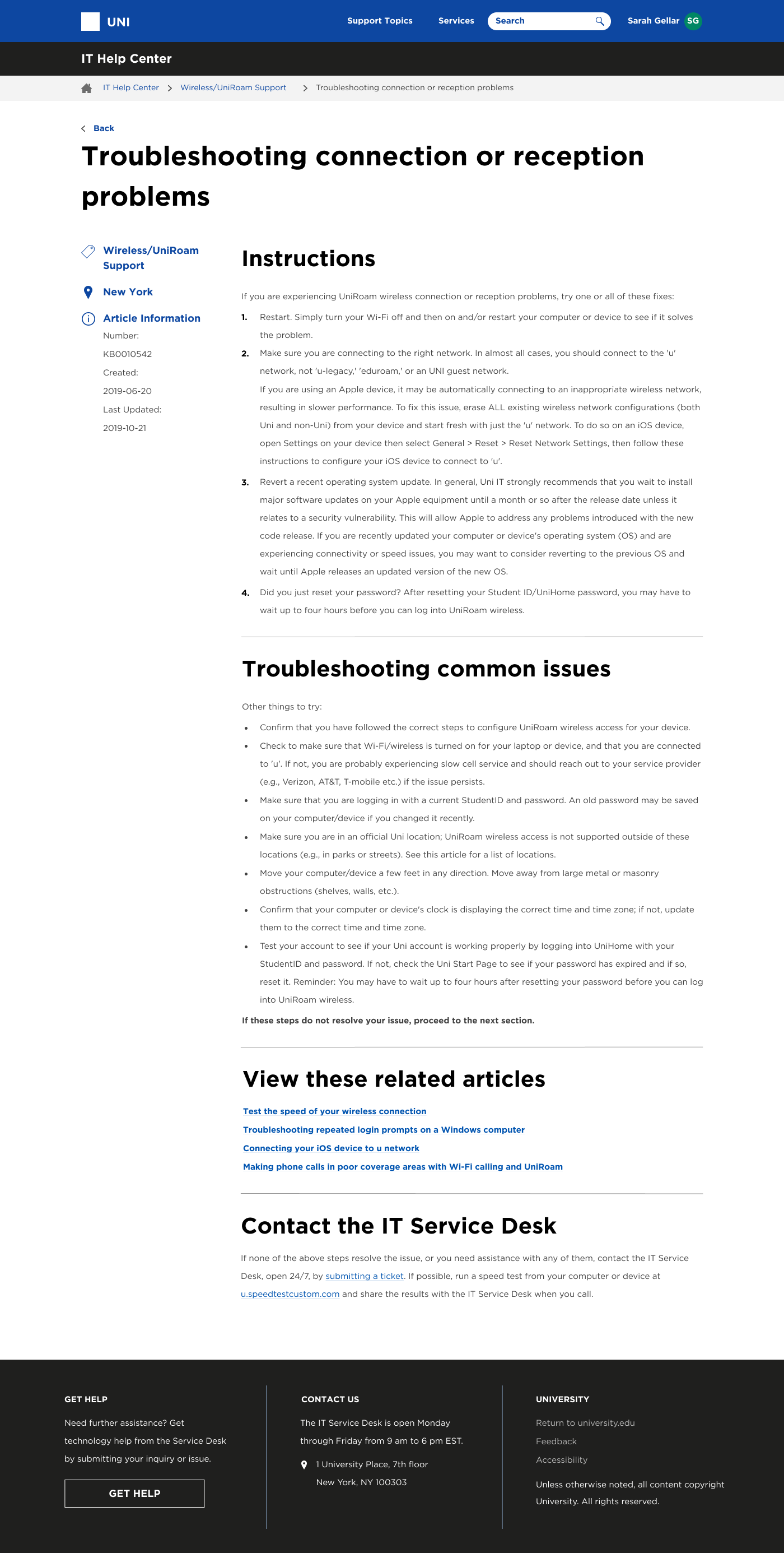
For example, a category page like ‘Identity & Access Management’ displays Popular Support Articles, Sub-Categories, ‘Did You Know’ information and important Calls to Action that previously a user would have needed to open a couple of knowledge articles or links to find.
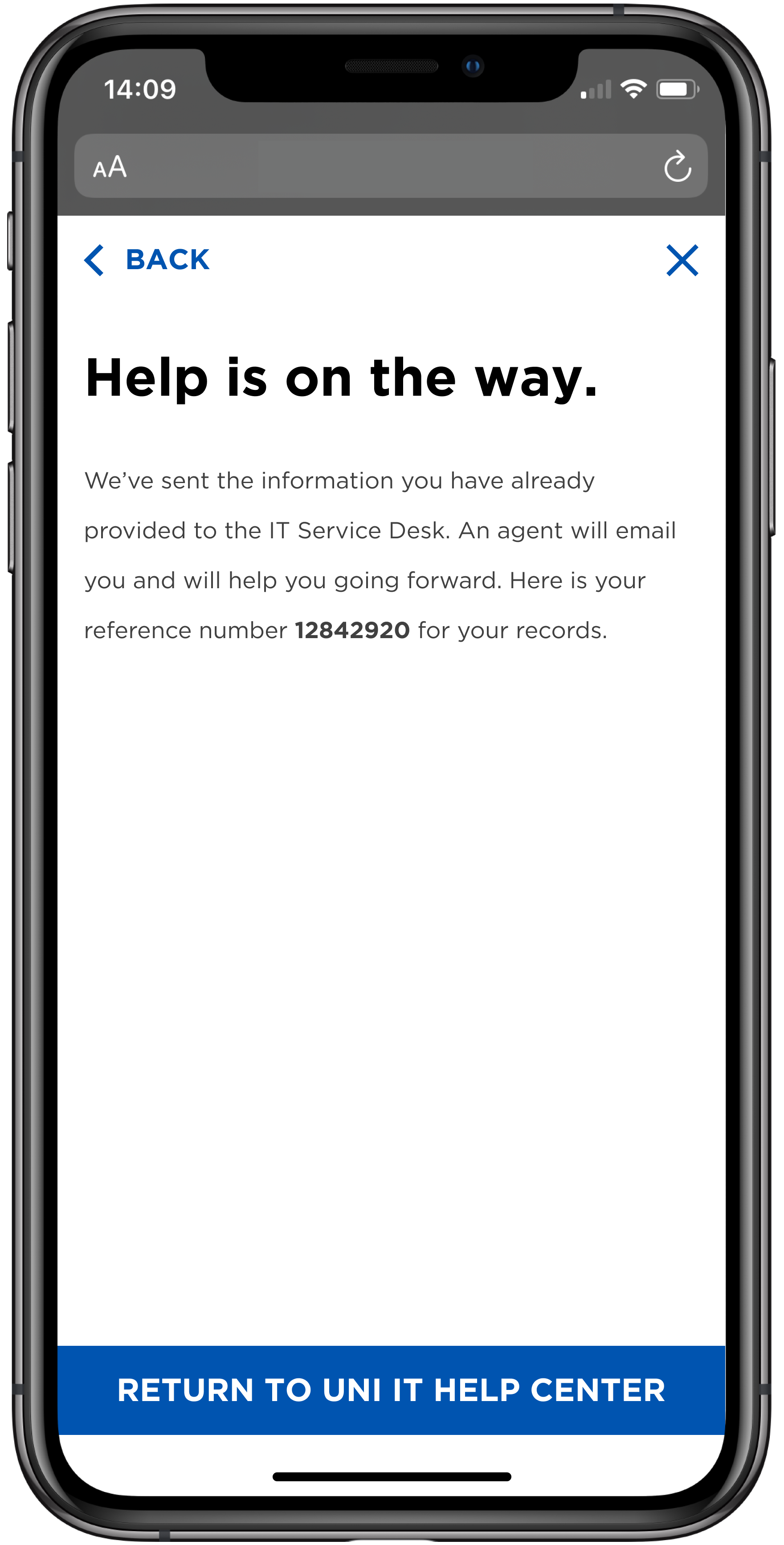
Get Help Form
It addresses how knowledge articles instruct users to seek additional help (if needed). Prior to this, most knowledge articles told the user to call or email the IT Help Desk.
While this MVP directs the user to a ‘Get Help’ form that is properly categorized based on the type of article the user was looking at when they clicked on the ‘Get Help’ link - helping both the user and the IT help agent.

The Article Visitor Experience
This MVP considers the visitor experience. For example, a visitor who needs to seek additional help beyond the articles is now told exactly what they should do. Prior to this, these instructions did not exist on the current platform and the visitor was at a loss.
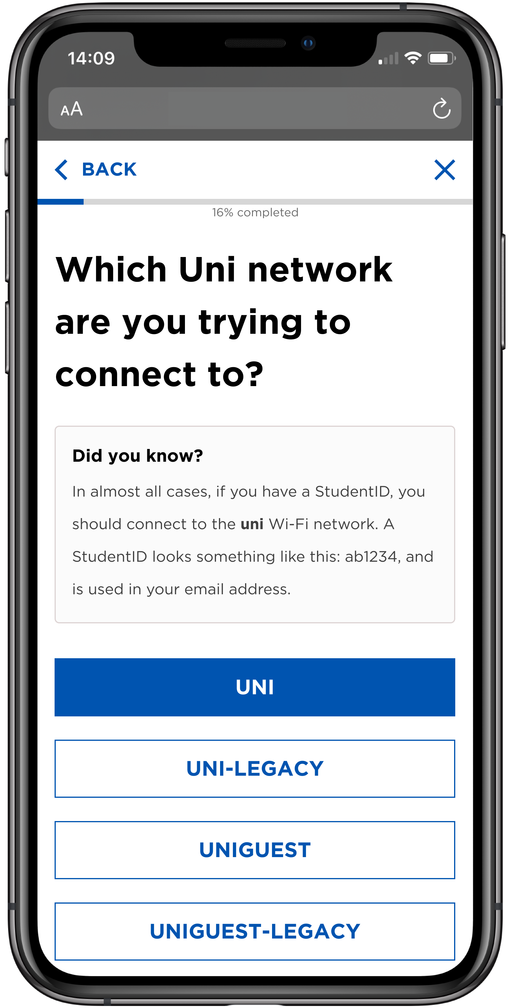
Mobile Self-Service
This MVP helps:
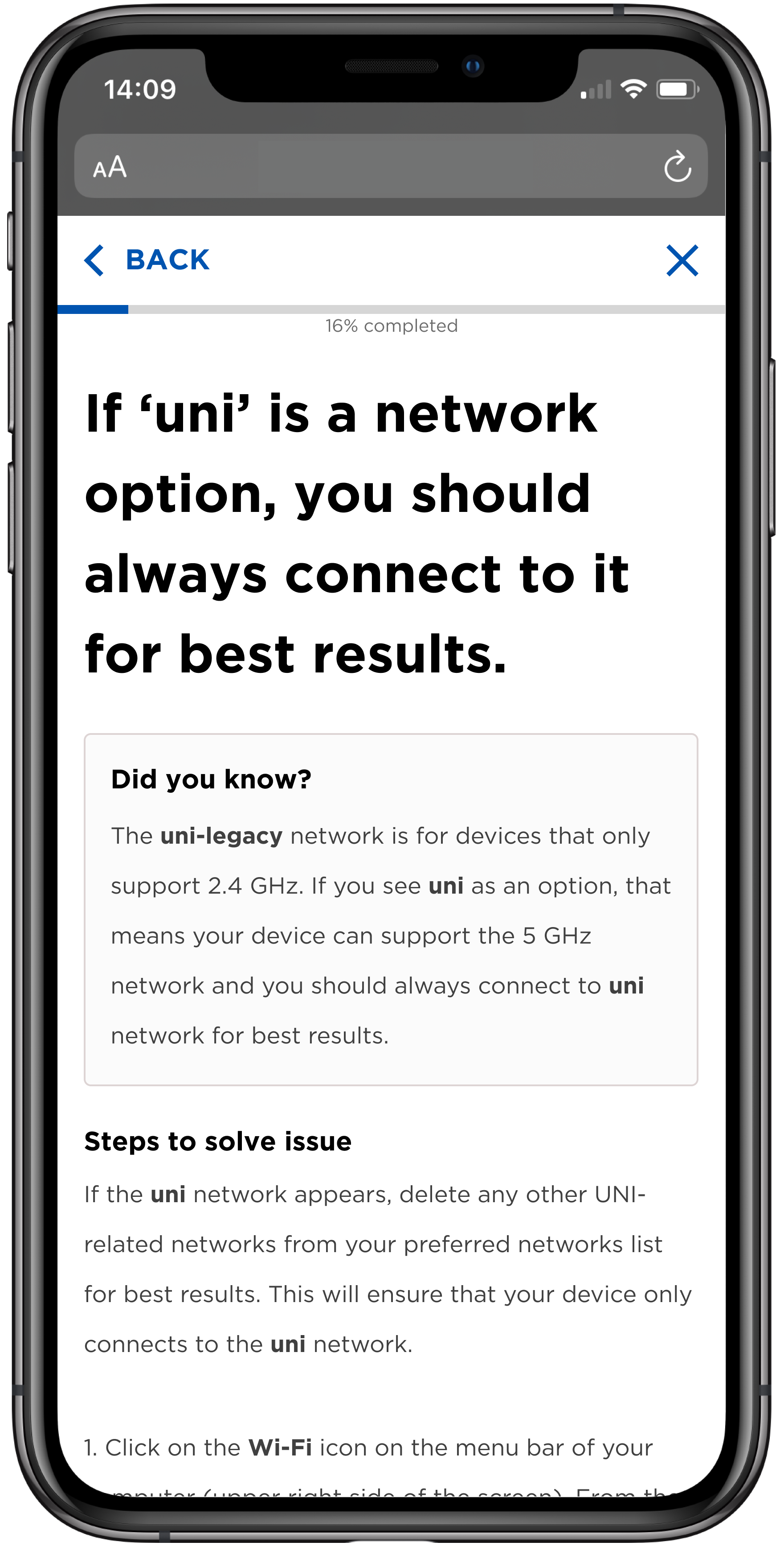
users self-diagnose their Wi-Fi issues
provides users with tailored solutions for their specific issues depending on the responses they select
allows users to potentially troubleshoot issues by themselves
simulates and digitizes the experience of getting help at the Service Desk
prepares for edge case scenarios make the experience where users reach dead-ends as easy as it can be to reduce the user’s frustration
encourage and teach users for the future
Which will result in:
a reduction in the number of tickets being submitted to Service Desk
users feeling like they can do it on their own without calling
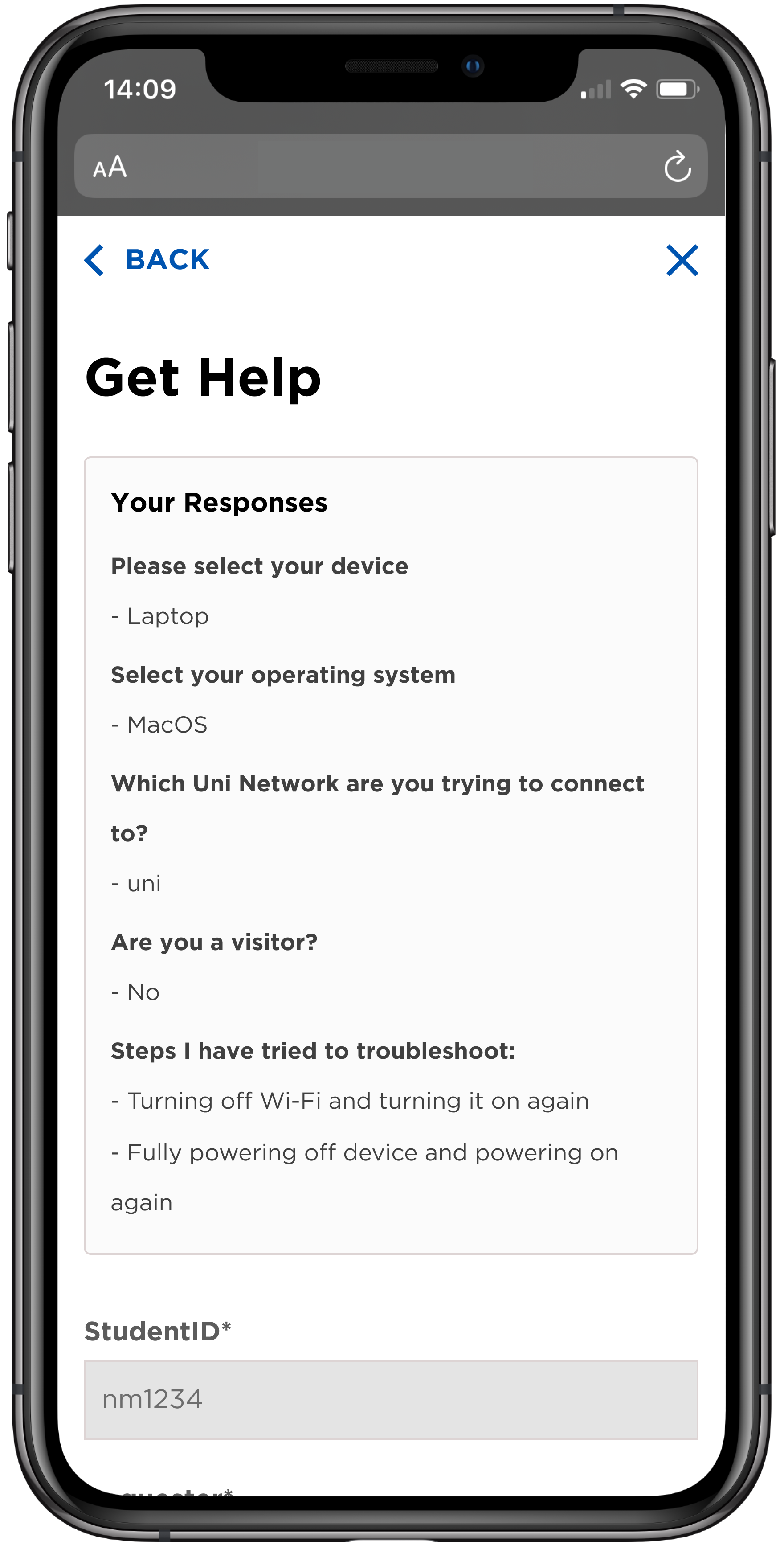
No Dead Ends Here
Prepares for edge case scenarios make the experience where users reach dead-ends as easy as it can be to reduce the user’s frustration.
For example, if users are facing a very complex issue and the self-diagnose wizard can’t help them, the wizard creates a ticket and informs the Service Desk of all the troubleshooting steps the user has already tried.
Saved Responses
Reduce the friction of users having troubles communicating their issues to Help Desk agents. Saves time and effort for the Service Desk agent. The agent no longer has to ask the user if they have tried steps A to F because the agent has already received this information.

Validating our Improvements with University Audiences
We designed prototypes and interviewed 22 users (students, faculty, and employees) from the university, spanning across user types from a spectrum of a novice to a technically savvy user. To measure the success of our projects, we asked participants to complete a series of tasks and answer questions based on their experiences. Some data gathered from our conversations revealed:
100% of users would use both tools again in the future
84.2% of users said they are ‘likely’ or ‘very likely’ to use the Wi-Fi wizard in the future
77.3% of users gave the new portal a rating of ‘good’ or ‘very good’
85% of users gave the Wi-Fi wizard a rating of ‘good’ or ‘very good’
Users felt that both MVPs were an improvement to the systems they were currently using. They were excited that this university was moving towards a better self-help experience.
Encouraging Design Forward Solutions
This work resulted with a number of insights and recommendations to solve for the challenge of getting digital IT help. Overall we have accomplished what we set out to do.
We provided 2 MVP solutions that target our project goals created with stakeholders and validated the value and direction of those solutions with usability testing. Based on our findings, we prioritized our recommendations and provided directions on what the university needs in order to ensure the success of their future implementation. Our design team also created a revised set of the university’s design system to influence the making of a new online portal that would serve as a singular source of information for IT help.

My Reflections as a Co-op Student
On a personal level, this was my first time handing off designs to developers in a professional capacity, and I was able to work through challenges of not knowing the process to being able to work with the developer team and compile assets and documentation for them.
This project (and co-op) gave me the opportunity to work in an interdisciplinary team in a business. I experienced a lot of different career paths within this co-op - product management, graphic design, UI/UX design, technology and development. The phrase “jack of all trades, master of none” used to scar me, but I found that it does not apply. I came out with the realization that being able to know and educate myself about everything makes me a better designer, because then I am able to synthesize all these different parts of a project and use my understanding to inform and be an advocate for my design decisions.
Accolades
Along with other RBC intern projects, my work was nominated to be shown in front of key stakeholders and subsequently, I was awarded Winter Co-op Student of the Term for 2019 out of 300 students.